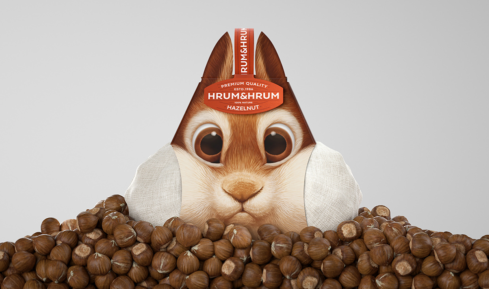
This packaging for Hrum & Hrum hazelnuts is just brilliant but that’s just half of what makes this story such a nutcracker.
I first spied this nutty packaging execution because a Creative Director I know, Kevin Ferry, shared the same on Linkedin. Kevin has an eye and knack for curating and sharing cutting-edge creative work. He happens to be quite a creative, colourful and all-round nice bloke himself. I happen to stumble into him in Singapore what must be years ago. You are likely to spot him from any crowd due to his tell-tale Fedora. I gave his post the applause it deserved and moved on with life. Why this is important to this tale will become evident a bit later. But back to the brand at hand and the packaging.
While I tend to keep an eye out for digital innovations and brand stories, this packaging is both simple and beautiful and is a story that is packed with a lot of flavour. What makes the packaging for Hrum & Hrum hazelnuts stand out is how it hits a particular visual cue that is well-know with anyone who grew up watching the cartoon Chip N Dale on a Saturday morning. The packaging dances perfectly in the grey area of ‘inspiration’, depicting a chipmunk heavily inspired by Jack Hannah’s creation, gobbling up nuts. Thus evoking a mnemonic that is so surely rooted in those children who have now grown up to become today’s shoppers, that it is just brilliant. This is just the nudge of nostalgia needed to move shoppers to give it a try. Was this their intention? Who knows? Probably the design team of Constantin Bolimond and Vareyko Tamara who hail from Minsk. Isn’t globalisation and internet just great! I am told the nut seller nut seller was so taken by the idea they bought the concept from the designer.I am told the execution is part of a larger packaging campaign that includes packaging that depicts a hamster and a mouse in similar creative fashion. So keep your eyes peeled for those.
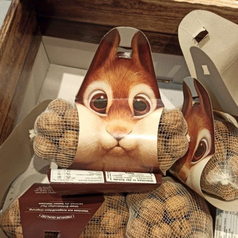
Now, everybody is a critic. There are those naysayers who might bay that this staging is totally unnecessary. Some may say that the packaging is a bit too innovative and that the visual mnemonic overpowers the brand awareness. I for one frankly couldn’t remember which brand this was for, because frankly the photo I saw circulated actually hid the brand label. On closer inspection I wonder if maybe the label was entirely missing in the final design execution. If you were to compare the photos of the concept on Behance and the Linkedin post you notice the brand label missing. Is it necessary at all? Maybe not. The packaging is so innovative in shape that anyone is going to be able to pick this out of the aisle. Its like how any child can identify a Toblerone or maybe a Malteser just from its packaging. True the one folly of the design is that it probably doesn’t lend for easy stacking in supermarkets. Which is why it seems to have been tossed into a bin. But at the end of the day this is a relatively minimalist eco-friendly packaging that offers a great deal of creativity and humour.
Now here is the other half of this nutty story. This execution is the brainchild of the folk at Seed to Branch. A marketing agency tucked away in Chester, England. Looks like a nice place on Google maps I say. So far away during these Covid times. Yet they are a small dynamic outfit painting bold creative strokes lead by founder Chris Branch and Digital Marketing Director Amanda Davidson. They tote themselves as a creative Linkedin Agency. An innovative niche and their brand promise is – “We are the Nurofen for your Linkedin headache.” How cool is that. In an age where Linkedin is being questioned to have become a place for self-sanctimonious preaching by individuals, this is an agency that promises to breathe some fresh air by making Linkedin its go-to branding channel for clients. The fact that Amanda Davidson is personally reaching out to connect with folk who liked the initial post that has been re-shared countless times is a testament to not only her talent but her dedication behind the idea. It’s not every day that you get a Linkedin invite from across the seas, just because you celebrated a post on Linkedin. The strategy is working. Like how. Do a search for Hrum & Hrum chestnuts on google you are flooded with so many articles in the first page of search results that you can’t tell if the brand has any other official presence. Definitely worth keep an eye out on this team, just to see if they go all out bananas with their next creative adventure.
Disclaimer: The views shared in this article are solely my own and do not represent the agency, designers or brands mentioned. I have not been paid for this post by any of these parties.

